Have you spent hundreds of dollars on a campaign to generate leads? Have few people taken action on the landing page you've directed them to?
In this post, we go over several reasons why someone might not take action on your page and provide solutions to increase your conversion rate. In fact, these are the main points we keep in mind when building landing pages, and they generally convert 15-30% of traffic to leads.
Use a dedicated landing page instead of a website page
There's a big difference between using a page on your website and a dedicated landing page for a campaign. A website page generally contains a lot of excess information that distracts the visitor away from your objective.
For example, if you're taking users to a website page, such as a home page or services page, that page will usually have links to other pages, links to social media accounts, blog content, etc. Each of those links is an opportunity for your visitor to get distracted.
For this reason, you need a dedicated landing page that limits the actions that a visitor can take to one or two: click to call the office and/or fill out a contact form.
Some ways to accomplish this are by:
Removing the header and footer
Removing social media share links
Removing links that redirect users to other pages
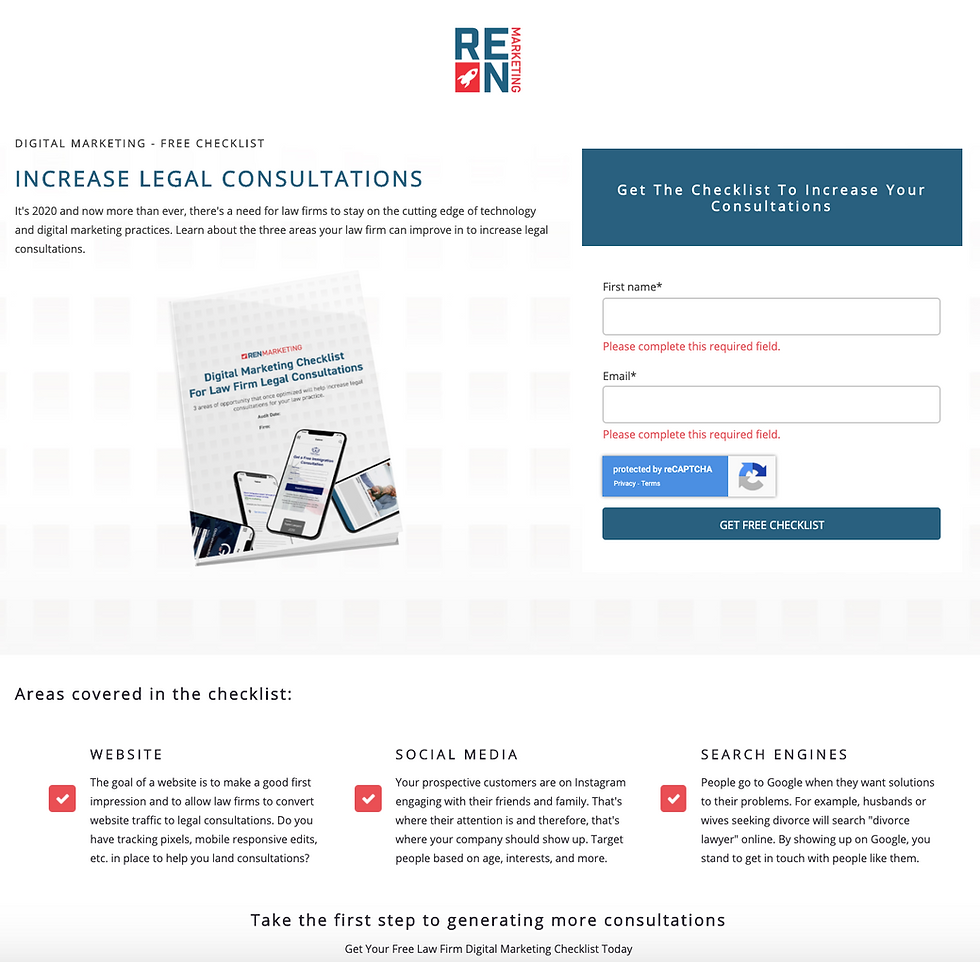
Take a look at this dedicated landing page example:

The visitor clearly only sees one action they can take: fill out the form to receive a free checklist. Reducing the chances someone gets lost is key to increasing your conversion rate.
Track lead conversions on your landing page
If you're sending traffic to a landing page, it's important to identify the traffic source that is yielding phone calls or form submissions.
Google Analytics can help you distinguish good traffic from bad traffic.
Better yet, are third-party providers like CallRail that make it easy to do all of the above plus track keywords, record calls, and send notifications to your team.
For example, call recording makes it possible for your team to qualify leads and/or strengthen the inbound sales process.

Make calls to action clear and easy to engage
The final point to improving your lead generation landing page is to ensure your calls to action, whether clicks to call the office or contact form submissions, are clear and easy to engage on the page.
By clear, we're saying that a visitor should immediately know what you want them to do.
This call to action can be presented with big and bold text that says "Schedule a Free Consultation Today" with a button that, once clicked, allows the visitor to place a call while they are on a mobile device. The best place to put such a call to action is above the fold, meaning, at the very top of the page, so that it's visible once a visitor lands on it.
By easy, we mean that buttons shouldn't redirect visitors to another page if you want someone to fill out a contact form. Instead, buttons can direct visitors to a section on that same page where the form is located, or the form can pop out on the screen when the button is clicked.

Making calls to action clear and easy to engage increases the likelihood that someone will take the expected action.
Wrapping it all up
Now that you've learned three ways to improve your lead generation landing page, it's time to start taking action.
Continuous improvement takes time.
Hopefully, this post has made it possible for you to cut the learning curve.
If you have any questions or are looking for a team to run lead generation campaigns for you, please feel free to reach out.